
Overview
Find & Filter Automatic Landing Pages (ALPs) have been introduced to help reduce load time on large Find & Filter result set. If you are not familiar with ALPs, you can read a more in-depth description of what Find & Filter ALPs are here.
Each Facet Navigation option can be set to display as an ALP, even if it does not meet the minimum ALP threshold. Each page that is set to an ALP can then utilise the Landing Page Description box to enter custom HTML and CSS using the source code.
Declaring a Navigation Option as an ALP
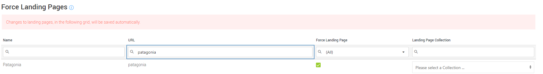
First, login to your Cloud MT account and go to 'Item Organisation > Find & Filter Landing Pages'. https://cloudmt.citruslime.com/#/filter-alp-management
This page allows you to Force any Facet Navigation option to display as an ALP. To do so, simply search for the option you'd like to set in the table and click the 'Force Landing Page' checkbox:
Editing ALP Descriptions
Once a Facet Navigation option has been forced to display as an ALP, find the same option within your 'Facet Navigation' and click 'Edit'. Within the 'Edit This Navigation Option' popup, click 'Next Step' and scroll down to see the 'View Advanced Options' button. Click this, and you will be presented with the 'Landing Page Description' box.
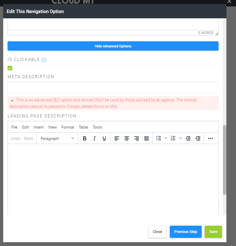
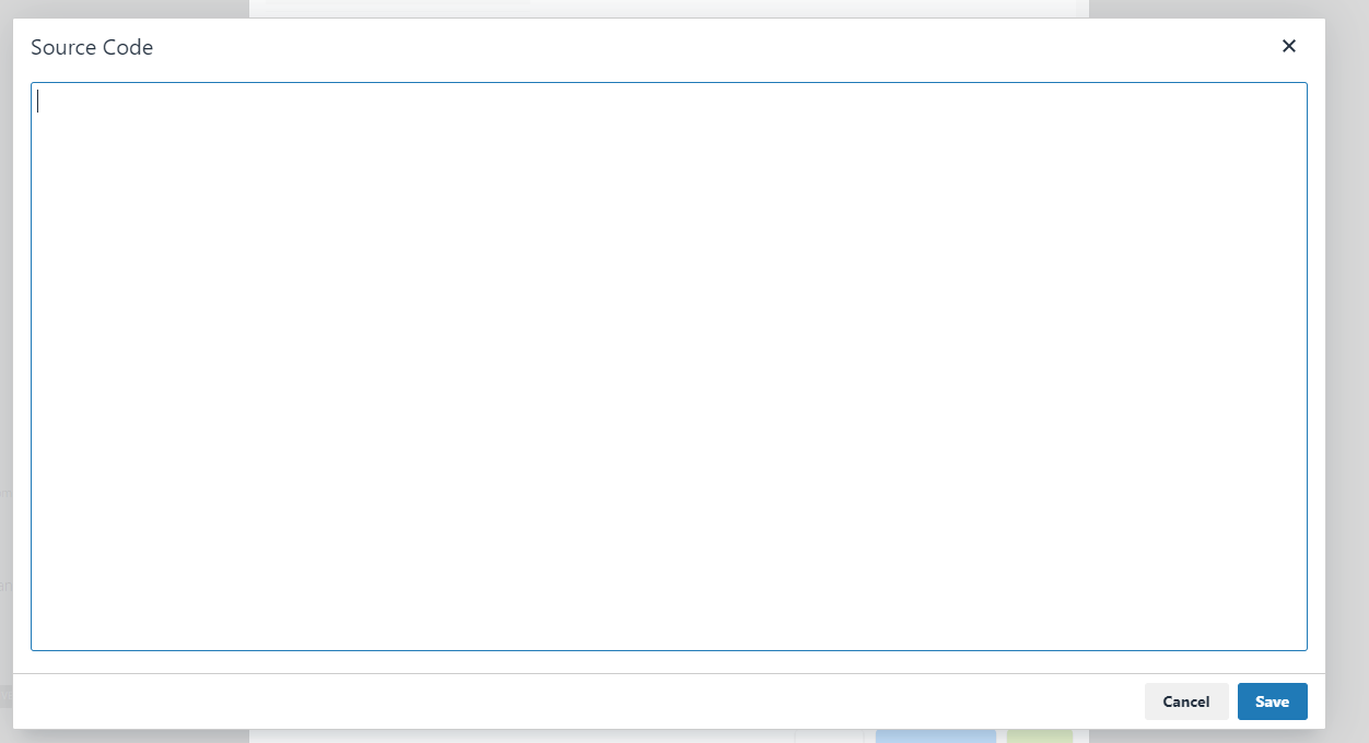
Any content added here will appear at the top of the ALP. To access the source code where you can add in HTML and CSS, click 'View (or Tools) > Source Code' to display the simple code editor.
Building your content
When building your HTML, be aware that not all structures of HTML will pass the validation and may be reformatted upon saving. For example, adding in the below code to the editor:
<span style="display: block">
    <a href="product-category" style="width: 100%">
        <div>
            <img src="image-path.jpg" alt="" style="width: 100%" />
        </div>
    </a>
</span>
Will render like so:
<span style="display: block"></span>
<div><img src="image-path.jpg" alt="" style="width: 100%" /></div>
<span style="display: block"></span>
I would advise sticking to a simple HTML structure with limited nested elements to keep the risk of the editor 'correcting' your code to minimal.
CSS Framework
The Citrus-Lime Modular platform comes with a pre-built CSS framework that you can make the most of to build your HTML. I have listed out the most commonly used classes at the bottom of this article that will help you with building your code.
Alternatively, you are able to use inline-styles on the majority of elements to achieve yours styling.
Adding Imagery
Cloud MT allows you to upload your own imagery to your website using your Image Gallery: https://cloudmt.citruslime.com/#/image-gallery
This article extensively covers how to use the image gallery, so that you can then reference images on your Find & Filter ALPs.
Final Notes
Once you are happy with our content, simply save your changes and view your creation*.
As mentioned previously, if you are struggling with the CSS or are in need of assistance, please get in touch with your account manager to discuss how the Citrus-Lime Design Team can create these pages for you.
* Please note, you will need to wait a few minutes for the site cache to clear before your changes will be visible on the site.
Commonly used Citrus-Lime CSS
.wrapper { width: 100%; float: left }
.grid { width: 100%; margin: 0 auto; padding: 0 }
.container { float: left; width: 100%; margin: 0;}
[class*='col-'] {padding: 0;float: left;}
.col-1 { width: 100% }
.col-2 { width: 50% }
.col-3 { width: 33.33% }
.col-4 { width: 25% }
.col-5 { width: 20% }
.col-6 { width: 16.66%  }
.col-8 { width: 12.50% }
.col-9 { width: 11.11% }
.col-10 { width: 10% }
.col-12 { width: 8.33% }
.col-90p { width: 90% }
.col-80p { width: 80% }
.col-75p { width: 75% }
.col-70p { width: 70% }
.col-66p { width: 66.66% }
.col-60p { width: 60% }
.col-40p { width: 40% }
.col-30p { width: 30% }
.col-25p { width: 25% }
.col-20p { width: 20% }
.col-10p { width: 10% }
.leftPadding {padding-left: 32px}
.topPadding { padding:32px 0}
.ctrPadLeft16 {padding-left: 16px}
.ctrPadTop32 { padding:32px 0}
.ctrPadSide32 {padding:0 32px}
.ctrPadTop16 { padding:16px 0}
.ctrPadSide16 { padding:0 16px}
.ctrPadLeft32 {padding-left: 32px}
.ctrPad32 {padding: 32px}
.ctrPad32-left {padding-left: 32px}
.ctrPad32-right {padding-right: 32px}
.ctrPad32-top {padding-top: 32px}
.ctrPad32-bottom {padding-bottom: 32px}
.ctrPad16 {padding: 16px}
.ctrPad16-left {padding-left: 16px}
.ctrPad16-right {padding-right: 16px}
.ctrPad16-top {padding-top: 16px}
.ctrPad16-bottom {padding-bottom: 16px}
.ctrPad8 {padding: 8px}
.ctrPad8-left {padding-left: 8px}
.ctrPad8-right {padding-right: 8px}
.ctrPad8-top {padding-top: 8px}
.ctrPad8-bottom {padding-bottom: 8px}
.ctrPad4 {padding: 4px}
.ctrPad4-left {padding-left: 4px}
.ctrPad4-right {padding-right: 4px}
.ctrPad4-top {padding-top: 4px}
.ctrPad4-bottom {padding-bottom: 4px}
.ctrPad0 {padding: 0}
.ctrPad0-left {padding-left: 0}
.ctrPad0-right {padding-right: 0}
.ctrPad0-top {padding-top: 0}
.ctrPad0-bottom {padding-bottom: 0}
.ctrPadTighten {padding-left: 22%;padding-right: 22%;}
.leftMargin {margin-left: 32px}
.ctrMrgLeft32 {margin-left: 32px}
.ctrMrgLeft16 {margin-left: 16px}
.ctrMgr32, .ctrMrg32 {margin: 32px}
.ctrMgr32-left {margin-left: 32px}
.ctrMgr32-right {margin-right: 32px}
.ctrMgr32-top {margin-top: 32px}
.ctrMgr32-bottom {margin-bottom: 32px}
.ctrMgr16, .ctrMrg16 {margin: 16px}
.ctrMgr16-left {margin-left: 16px}
.ctrMgr16-right {margin-right: 16px}
.ctrMgr16-top {margin-top: 16px}
.ctrMgr16-bottom {margin-bottom: 16px}
.ctrMgr8, .ctrMrg8 {margin: 8px}
.ctrMgr8-left {margin-left: 8px}
.ctrMgr8-right {margin-right: 8px}
.ctrMgr8-top {margin-top: 8px}
.ctrMgr8-bottom {margin-bottom: 8px}
.ctrMgr4, .ctrMrg4 {margin: 4px}
.ctrMgr4-left {margin-left: 4px}
.ctrMgr4-right {margin-right: 4px}
.ctrMgr4-top {margin-top: 4px}
.ctrMgr4-bottom {margin-bottom: 4px}
.ctrMgr0 {margin: 0}
.ctrMgr0-left {margin-left: 0}
.ctrMgr0-right {margin-right: 0}
.ctrMgr0-top {margin-top: 0}
.ctrMgr0-bottom {margin-bottom: 0}
*[class*="zflex"] {display: -webkit-box;display: -moz-box;display: -ms-flexbox;display: -webkit-flex;display: flex;flex-direction: row;}
*[class*="zflexInline"] {display: -webkit-inline-flex;display: -ms-inline-flexbox; display: inline-flex;}
.zflex-w, .zflexInline-w {flex-wrap:wrap; display: -webkit-flex; -webkit-flex-wrap: wrap; -ms-flex-wrap: wrap; display: flex;   flex-wrap: wrap;}
.zflex-s, .zflexInline-s {align-items:stretch; -webkit-align-items:stretch; -ms-align-items:stretch; -moz-align-items:stretch;}
.zflex-ws, .zflexInline-ws {flex-wrap:wrap;-webkit-flex-wrap:wrap;-ms-flex-wrap:wrap;-moz-flex-wrap:wrap;align-items:stretch;-webkit-align-items:stretch; -ms-align-items:stretch; -moz-align-items:stretch;}
.zflex-v, .zflexInline-v { justify-content:center; -webkit-justify-content:center; -moz-justify-content:center; -ms-justify-content:center; align-content:center; align-items:center; -webkit-align-items:center; -moz-align-items:center; -ms-align-items:center; }
.zflex-hm, .zflexInline-hm {display: -webkit-inline-flex; display: -ms-inline-flexbox; display: inline-flex;flex-wrap:wrap; -webkit-flex-wrap:wrap; -moz-flex-wrap:wrap; -ms-flex-wrap:wrap;}
.zflex-vs, .zflexInline-vs { align-items:center; -webkit-align-items:center; -moz-align-items:center; -ms-align-items:center; flex-wrap:wrap; -webkit-flex-wrap:wrap; -moz-flex-wrap:wrap; -ms-flex-wrap:wrap; }
.zflex-sa, .zflexInline-sa { justify-content: space-around; -webkit-justify-content: space-around; -moz-justify-content: space-around}
.zflex-sb, .zflexInline-sb { justify-content: space-between; -webkit-justify-content: space-between; -moz-justify-content: space-between}
.wrap {-webkit-flex-wrap: wrap; -ms-flex-wrap: wrap; display: flex;   flex-wrap: wrap;}